Colour 103: Colour System
- sharmistha

- Feb 17, 2025
- 6 min read
Updated: Feb 19, 2025
A color system is a structured way of organizing, defining, and reproducing colors. It provides a framework for understanding how colors relate to each other and how they can be created, mixed, or used in various media. Different color systems are used depending on the context—such as digital screens, printing, or painting.
Munsell Colour System
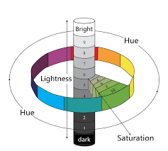
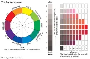
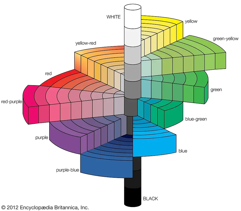
The Munsell Color System, developed by artist and professor Albert H. Munsell in the early 20th century, is a method for describing colors based on three properties: Hue, Value, and Chroma. Unlike traditional color wheels, the Munsell system organizes colors in a three-dimensional space to reflect how we perceive color differences.
📌 The Three Dimensions of Color:
Hue (Color Type)
Hue refers to the color family or the "type" of color (e.g., red, blue, green).
Munsell identified five principal hues and five intermediate hues, making a total of 10 hues:
Principal: Red (R), Yellow (Y), Green (G), Blue (B), Purple (P)
Intermediate: Yellow-Red (YR), Green-Yellow (GY), Blue-Green (BG), Purple-Blue (PB), Red-Purple (RP)
Hues are arranged in a circular order similar to a color wheel.
Value (Lightness or Darkness)
Value represents how light or dark a color is.
It is measured on a scale from 0 (pure black) to 10 (pure white).
Think of it as a grayscale ladder. Adding white to a hue creates a tint, and adding black creates a shade.
Chroma (Color Intensity or Purity)
Chroma measures how pure or saturated a color is, or how much it deviates from a neutral gray.
Chroma values start from 0 (neutral gray) and increase as the color becomes more vivid or intense.
Different hues reach different maximum chroma levels. For example, yellow has a higher maximum chroma than blue.
📊 How the Munsell System is Written:
Munsell colors are described using the format:[Hue] [Value]/[Chroma]For example:
5R 5/10 = A red color with medium value and high chroma.
10YR 8/4 = A yellow-red hue with a light value and moderate chroma.
🌈 Visualizing the Munsell System:
The Munsell color space looks like an irregular three-dimensional tree or spindle:
The vertical axis represents Value (lightness to darkness).
The horizontal axis represents Chroma (neutral to vivid).
The colors are arranged around the axis by Hue.
🖼️ Applications of the Munsell Color System:
Art and Design: Used to teach color theory and create harmonious palettes.
Soil Science: Used for soil classification (e.g., Munsell Soil Color Charts).
Industry and Manufacturing: Standardizes colors for consistent production.
Medicine: Helps in describing skin tones for dermatological studies.
Natural Colour System (NCS)
The Natural Colour System (NCS) is a color system based on how humans perceive colors. Unlike systems built on mixing pigments or light, NCS is entirely perceptual, focusing on how colors appear to the human eye. It was developed in Sweden by the Scandinavian Colour Institute and is widely used in design, architecture, and industry for color communication and matching.
👁️ Perceptual Basis of NCS
NCS is based on the theory that humans perceive all colors as variations of six elementary colors:
White (W)
Black (S)
Yellow (Y)
Red (R)
Blue (B)
Green (G)
These elementary colors are pure visual experiences. For example, you can imagine a pure red that isn’t tinged with any other color, even if it can’t be physically mixed using pigments.
🌟 NCS Colour Space
The NCS system maps all colors in a three-dimensional space defined by:
Hue (The color type, e.g., red, blue)
Blackness (S) (How dark a color is)
Chromaticness (C) (How intense or saturated a color is)
Whiteness (W) (How light a color is)
The NCS color space is shaped like a double cone:
The top point is pure white (W).
The bottom point is pure black (S).
The outer rim of the cone represents fully saturated colors (high chromaticness).
📊 NCS Notation System
Every color is described using a unique NCS notation, which provides a complete description of its hue, whiteness, blackness, and chromaticness.
NCS Notation Example: S 1050-Y90R
S: Standardized (from the new NCS 2nd edition)
10: 10% Blackness
50: 50% Chromaticness
Y90R: 90% Red and 10% Yellow (Hue)
👉 How to Read: A strong, warm red with moderate saturation and a little darkness.
🎨 NCS Colour Circle (Hue) and Triangle (Nuance)
NCS Colour Circle: Shows how hues transition around the elementary colors (Y, R, B, G).
NCS Colour Triangle: Represents the relationships between Blackness, Whiteness, and Chromaticness for a single hue.

📌 Applications of NCS
Architecture: Ensures accurate color matching across materials (paints, tiles, fabrics).
Interior Design: Helps create harmonious color schemes.
Product Design: Consistent color reproduction in manufacturing.
Branding: Maintains uniform brand colors across print and digital media.
💡 Fun Fact:
NCS is recognized as a national color standard in Sweden, Norway, and Spain, making it a crucial tool for designers and manufacturers in these countries
For more info : www.ncscolour.com
Pantone
The Pantone Colour System is a global color matching system used across industries such as printing, design, fashion, and product manufacturing. Developed by Pantone Inc. in 1963, it is known for its Pantone Matching System (PMS), which standardizes colors to ensure consistency and accuracy across different materials and industries.
🟠 What is Pantone?
📅 Founded: 1962 by Lawrence Herbert
🟡 Headquarters: Carlstadt, New Jersey, USA
📘 Famous for: PMS (Pantone Matching System)
🌟 Used in: Printing, Textiles, Fashion, Graphic Design, and Interior Design
🖍️ Pantone Matching System (PMS)
The PMS is a proprietary color space used in:
🖨️ Printing (Spot Colors): Each color is standardized with a unique code.
🎨 Design: Designers use PMS to ensure their colors match on screen and print.
🧵 Fashion & Textiles: Color standards for fabrics, plastics, and paints.
🧩 Pantone Colour Code Structure:
Pantone colors are identified by a unique number and suffix, which indicates the material:
Example: Pantone 185 C
185: Color number (a bright red)
C: Coated (for glossy paper)
U: Uncoated (for matte paper)
TPX: Textile Paper Extended (for fabrics)
🌈 Pantone Colour Guides
Pantone colors are presented in guides or swatch books, such as:
Pantone Formula Guide: Spot colors for print.
Pantone Fashion, Home + Interiors (FHI): Colors for textiles and interiors.
Pantone CMYK Guide: Process colors for digital printing.
Pantone Metallics & Pastels Guide: Specialty colors.
🌟 Pantone Colour of the Year
Since 2000, Pantone has selected a Colour of the Year, which influences trends in fashion, interiors, and design.
2022: Very Peri (PANTONE 17-3938) – A dynamic periwinkle blue hue
2023: Viva Magenta (PANTONE 18-1750) – A bold, vibrant red
2024: Peach Fuzz (PANTONE 13-1023) – A soft, velvety peach tone
⚙️ Pantone vs. Other Colour Systems (NCS, Munsell, Dulux):
Feature | Pantone | NCS | Munsell | Dulux/ICI |
Type | Proprietary (Print/Textile) | Perceptual System | Perceptual + Scientific | Proprietary (Paint) |
Application | Print, Fashion, Design | Architecture, Design | Scientific Research | Paint & Architecture |
Numbering System | Unique Code + Material | Hue, Blackness, Chromaticness | Hue, Value, Chroma | Hue, LRV, Chroma |
Industry Standard | Global | Europe-focused | Scientific/Educational | Paint and Coatings |
✅ Key Advantages of the Pantone Colour System:
📘 Industry Standard: Universally used across design fields.
🎨 Wide Colour Range: Spot colors, pastels, metallics, and neons.
🔄 Cross-Material Matching: Consistent colors on print, fabric, plastic, and paint.
📲 Digital Integration: Supported by software like Adobe Photoshop, Illustrator, and InDesign.
Hex (Hexadecimal) Codes
Hex Codes are a six-digit alphanumeric code used in web design and digital graphics to represent colors. The code is based on the RGB (Red, Green, Blue) color model, with each pair of digits representing the intensity of red, green, and blue on a scale of 00 to FF (hexadecimal 0 to 255).
🖌️ Structure of a Hex Code:
A hex code begins with a # (hash symbol), followed by six characters:
RR – Red (00 to FF)
GG – Green (00 to FF)
BB – Blue (00 to FF)
🌈 Example:
🎨 Blending Colors with Hex Codes:
🌞 Shades and Tints:
HSV/HSL
HSV (Hue, Saturation, Value) and HSL (Hue, Saturation, Lightness) are two color models used in digital graphics to represent and manipulate colors more intuitively than the RGB model. Both models separate the hue (color type) from the intensity and brightness aspects, making them useful for color selection and editing.
Differences Between HSV and HSL
Feature | HSV (Hue, Saturation, Value) | HSL (Hue, Saturation, Lightness) |
Brightness Component | Value (V) – Represents the brightest color component. When V = 1, the color is fully bright. | Lightness (L) – Represents the average of the highest and lowest RGB values, making it more centered between black and white. |
Saturation Calculation | S = (Max - Min) / Max – Saturation is based on how much the color deviates from pure brightness. | **S = (Max - Min) / (1 - |
Black and White Handling | At V = 0, the color is black. | At L = 0, the color is black; at L = 1, the color is white. |
Mid-Tone Handling | HSV prioritizes brightness (useful in lighting and shading). | HSL provides more natural tints and shades. |
Application | Common in computer graphics, image processing, and lighting effects. | Preferred in UI/UX design and color palettes due to its perceptual balance. |
Key Observations
HSV is more aligned with human perception in terms of how brightness works.
HSL is better for maintaining color harmony in design applications.
Both models transform colors mathematically, but HSL produces a more natural gradient effect, while HSV handles highlights and shadows better.
This is not an exhaustive list of colour systems, but it includes the most important ones. There are many other systems, such as Dulux/ICI, RAL Colour, Federal Standard, British Standard, and the CIE Colour System.
Comments