Colour 101: Understanding the Basics of Colour.
- sharmistha

- Feb 15, 2025
- 5 min read
Updated: Feb 18, 2025
🌈 What is Color?
The color of an object is determined by the wavelengths of visible light that are reflected or transmitted, then perceived by the human eye.
👁️ How Do We See Color?
Humans are trichromats: We have three types of cones in our eyes—one for red, one for green, and one for blue.
📜 A Bit of History:
The color spectrum was first identified by Isaac Newton in 1666.
📊 Visible Spectrum:
The human eye detects wavelengths from approximately 400 nm (violet) to 750 nm (red).
Violet: Shortest wavelength = Highest frequency = More energy = Scatters most (More refraction, more bending)
Red: Longest wavelength = Lowest frequency = Less energy = Scatters least (Less refraction, less bending)
🎉 Fun Trivia and Applications:
Why is Red for Warnings? Longer wavelengths scatter the least, so red light travels farther through fog, dust, or rain, making it perfect for warnings and signals.
Why is the Sky Blue? Shorter wavelengths (blue and violet) scatter more than longer wavelengths. Although violet scatters the most, our eyes are more sensitive to blue, and the sun emits less violet light, making the sky appear blue.
Why are Sunsets Red or Orange? At sunset, sunlight passes through more atmosphere, scattering blue and green wavelengths. Only the longer wavelengths (red, orange, pink) reach your eyes, creating those warm colors.
💜 Understanding Purple (Magenta):
Purple is a perceived color rather than a spectral color, meaning it is created by combining red and blue light.
Purple does not exist as a single wavelength but is a construct of the brain, filling the gap between red and violet on the color wheel.
The absence of green (opposite on the color wheel) can enhance the sensation of purple, making it feel vivid and rich.
Additive and subtractive Colour system
💡 Immaterial Color – Light (Additive System)
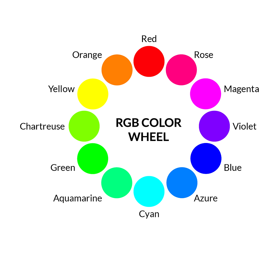
Primary Colors: Red, Green, Blue (RGB)
Secondary Colors:
🟡 Red + Green = Yellow
🟦 Green + Blue = Cyan
💜 Blue + Red = Magenta
Uses: Digital displays (monitors, phone screens)
Memory Tip: 🎨 In the additive system, mixing all colors results in white. More colors = brighter.
🖌️ Material Color – Pigment (Subtractive System)
Primary Colors:
🎨 Painting (RYB): Red, Yellow, Blue
🖨️ Printing (CMY): Cyan, Magenta, Yellow
Secondary Colors:
RYB Model:
🟠 Red + Yellow = Orange
🟢 Blue + Yellow = Green
💜 Blue + Red = Violet
CMY Model:
🟦 Cyan + Magenta = Blue
🔴 Magenta + Yellow = Red
🟢 Yellow + Cyan = Green
Important Note: 🖨️ In CMY, all colors mixed create a murky dark color, not true black. Printing adds a separate black (K) ink for accuracy (CMYK system).
Uses: Printing, painting
Memory Tip: 🖌️ In the subtractive system, all colors combined produce black. Less Colour = Brighter
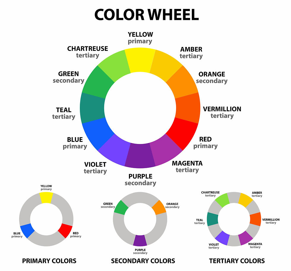
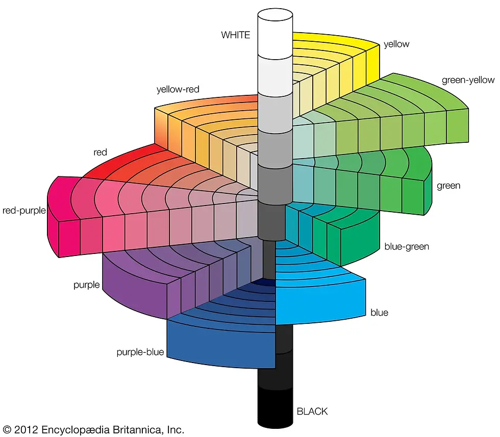
Colour Wheel
A color wheel is a circular diagram that organizes colors by their relationship to one another. It is a fundamental tool in color theory, used to understand and create color harmonies.
Types of Color Wheels:
RYB (Traditional) Color Wheel: Used in painting and traditional art.
RGB (Additive) Color Wheel: Used for digital screens.
CMY (Subtractive) Color Wheel: Used in printing.
Keywords
🔹 Primary, Secondary, Tertiary Colors:
Primary Colors: Fundamental colors that cannot be created by mixing other colors.
RYB (Traditional): Red, Yellow, Blue (used in painting)
RGB (Light): Red, Green, Blue (used in screens)
CMY (Printing): Cyan, Magenta, Yellow
Secondary Colors: Formed by mixing two primary colors.
RYB: Orange (Red + Yellow), Green (Yellow + Blue), Violet (Blue + Red)
CMY: Red (Magenta + Yellow), Green (Yellow + Cyan), Blue (Cyan + Magenta)
Tertiary Colors: Created by mixing a primary and a secondary color.
Examples: Red-Orange, Yellow-Green, Blue-Violet
❄️🔥 Cool & Warm Colors:
Cool Colors: Associated with water and ice. Blues. — evoke calm and serenity. Best for: Backgrounds, relaxed moods.
Warm Colors: Associated with fire and heat. Reds, oranges, yellows — convey energy and warmth. Best for: Focal points, lively moods.
Neutral Colors: Greens and Purples.
Temperature is Comparative, warmer hues can have cooler tones and cool hue can have warmer tones.

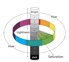
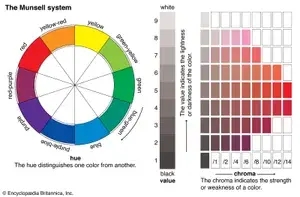
🎨 Hue, Chroma, Value, Tint, Tone, Shade:
Hue: The pure color name (e.g., red, green, blue). It's the color family.
Chroma: The purity or intensity of a color without white, black, or gray.
Value: How light or dark a color is.
Tint: A hue + white (light version of the color).
Tone: A hue + gray (muted version of the color).
Shade: A hue + black (dark version of the color).
🔑 Key Differences
Value vs. Chroma:
Value: Light/dark (changed with white/black).
Chroma: Intensity (reduced with gray).
Example: Pastel pink (high value, low chroma) vs. deep magenta (low value, high chroma).
Saturation vs. Chroma:
Chroma: The inherent, objective property of a color—its purity or intensity without considering brightness or darkness. It’s about how vivid or dull the color is at its core. It is independent of its surrounding.
Saturation: Vividness of a colour relative to its surrounding (atmospheric light and contrast with surrounding colours).
Think of chroma like the raw spice level of chili powder—it’s a constant.
Think of saturation like the spiciness you taste—it can change depending on the dish (lighting, context). Chroma is Objective, Saturation is Perceptual
Value vs. Saturation:
Value: Light or dark (e.g., pink vs. deep red).
Saturation: Bright or dull (e.g., neon pink vs. dusty rose).
Yellow and blue can have the same value if they are equally light or dark.A monochrome image is all about values—no hues or saturation.
🌈 Tints, Tones, Shades Explained:
Tint (Hue + White): Lightens the color, increases value, reduces chroma and saturation.Example: Red → Pink (lighter, less intense)
Shade (Hue + Black): Darkens the color, decreases value, reduces chroma, but may retain high saturation if vivid.Example: Red → Burgundy (darker, duller)
Tone (Hue + Gray): Lowers both chroma and saturation, shifts value depending on gray’s lightness or darkness.Example: Red → Brick Red (muted, less pure)
🎨 How They Relate to Color Properties:
Value (Lightness/Darkness): Tints, tones, and shades all change value.
Chroma (Color Purity): Reduced by tints, tones, and shades.
Saturation (Color Intensity): Reduced the most by tones (gray).
Quick Cheats:
Tints → Higher value, lower chroma & saturation
Shades → Lower value, lower chroma, but can stay vivid
Tones → Lower value, chroma, and saturation
Colour Harmony
Color harmony refers to pleasing combinations of colors based on their relationships on the color wheel.
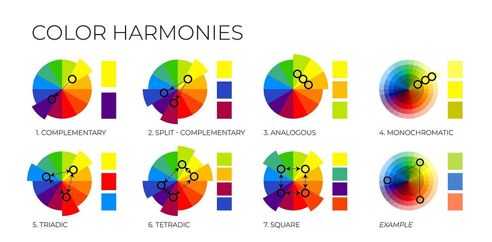
🖼️ Types of Color Harmony :
🎨 Monochromatic: Shades (dark) and tints (light) of one Hue. Example: Sky blue, blue, navy. When it is simply black and white, it is called Achromatic.

🎨 Analogous: Three Hues side-by-side on the wheel. Three connected segments. Example: Red, orange, yellow.

🎨 Complementary: Opposite Hues on the wheel. Direct line across the wheel. Example: Blue and orange.

🎨 Split-Complementary: Base color + two neighbors of its complement. Y-shaped selection. Example: Blue, yellow-orange, red-orange.

🎨 Triadic: Three colors equally spaced on the wheel. Triangle overlay. Example: Red, yellow, blue.
🎨 Tetradic (Double Complementary): Two complementary pairs. Rectangle overlay. Example: Blue, orange, green, red.

Tetradic (Double Complementary)
🚀 Quick Tips:
Use Monochromatic for simplicity and elegance.
Choose Analogous for a harmonious, calming palette.
Try Complementary for bold, striking contrasts.
Use Triadic for vibrant, dynamic designs.
Opt for Tetradic for rich, colorful schemes.
Understanding the basics of colour is fundamental for every artist, designer and filmmakers. In next few blog posts I will delve into Law of Simultaneous contrast, psychology of colour and colour systems.
Comments